|
1. Discuss your decision on pen and ink or pencil techniques. Why you chose to use one or more.
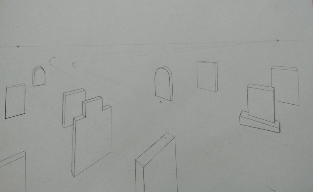
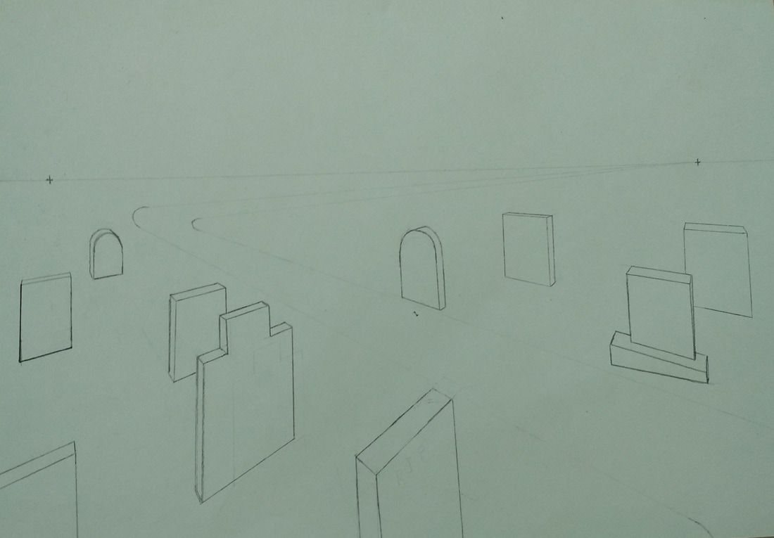
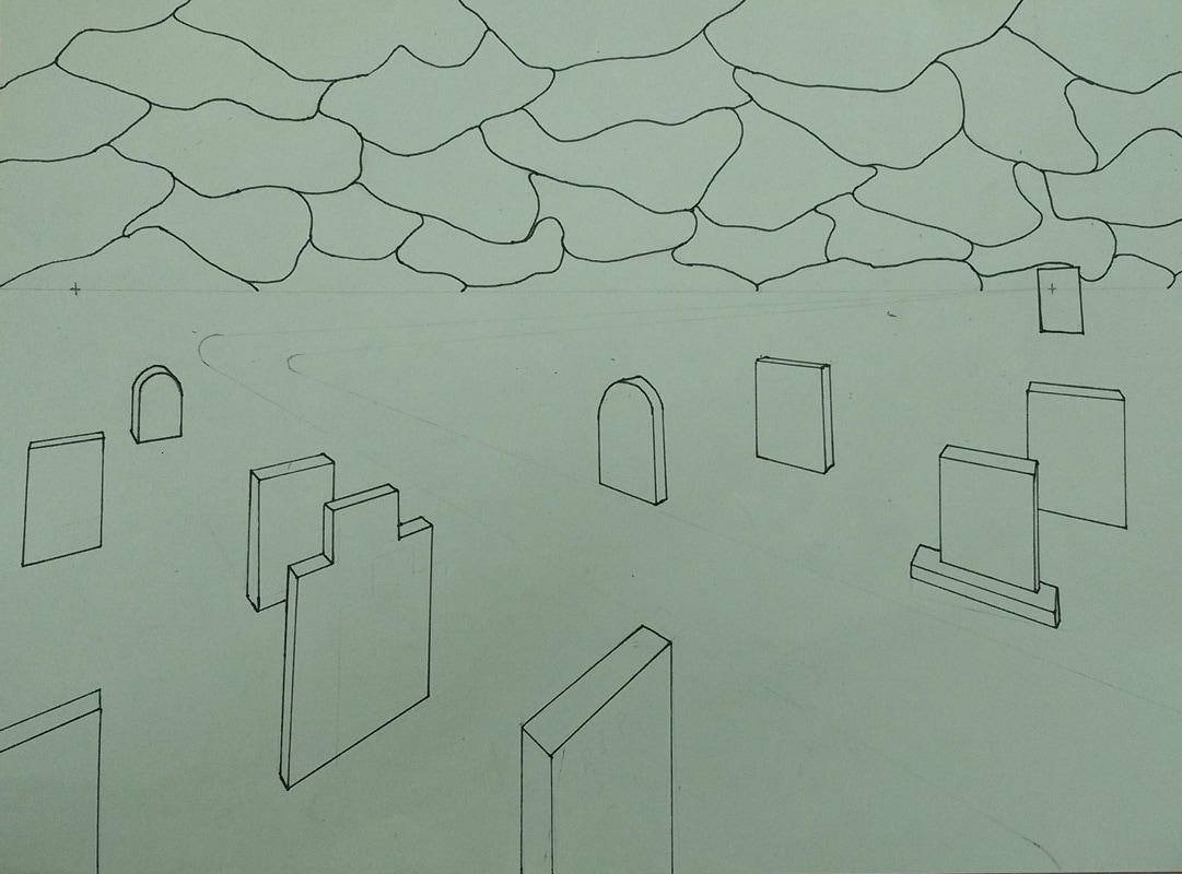
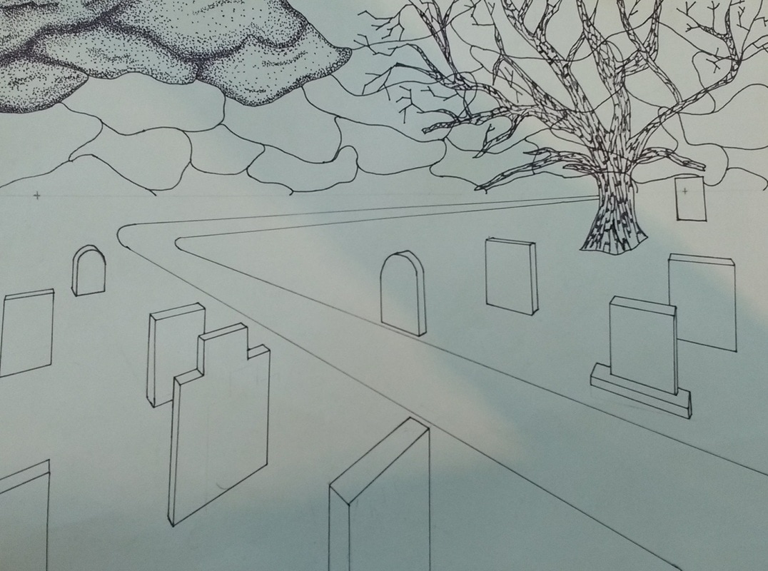
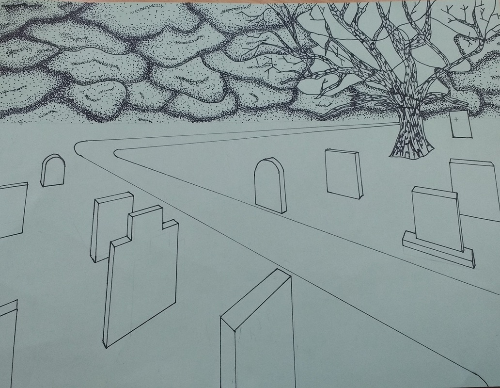
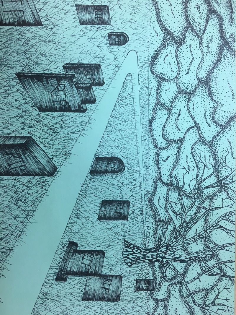
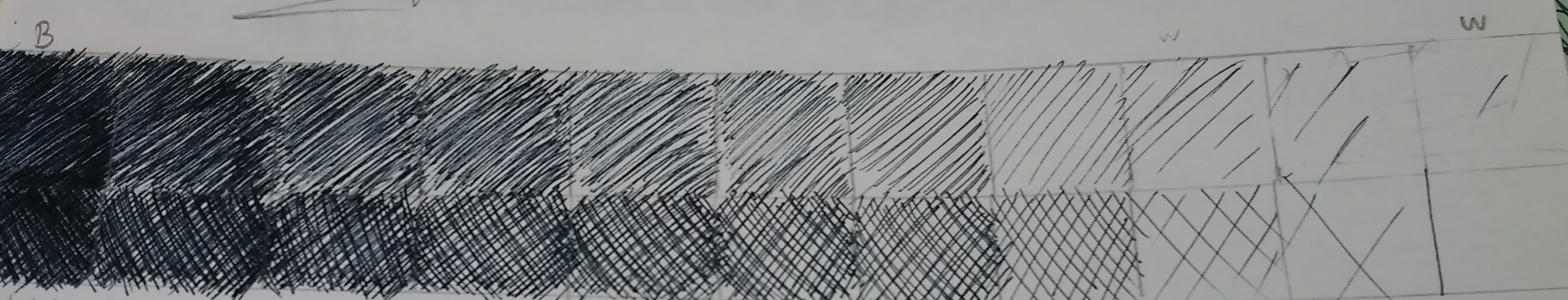
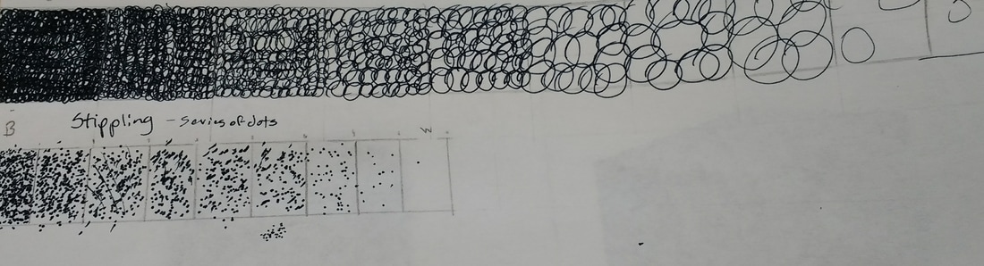
For my perspective project, I used three pen and ink techniques. For the first technique, I used stippling. It was used for the clouds because stippling is easy to control. Thus, I was able to use the dots to give the clouds a darker shade where they meet and lighten up where they are farther apart. Secondly, I used hatching. I used hatching on the graves because it was a nice contrast from the stippled clouds. Lastly, I used the pen and made small marks on the trees to make bark. I used this because it was recommended by Ms. Rossi, and also because it brought the tree out from the clouds. 2. How is texture important in your composition? Texture is important in my composition because it helps distinguish each of the objects. For example, the clouds were stippled because it was easier to give it a ''fluffy'' feel. The tree has lines in it that make it look like bark to make it look different from everything else. The hatching done in the grave makes them super dark making it easy to tell apart from the grass. The grass, well... I didn't know any other way to do grass. Overall, the texture really made each part of my composition stick out. 3. Why is value so important in this project? Value was very important in my project because it helped promote perspective. Without value, the project would look very 1-dimensional. Value made it easy to tell what direction objects were faced. Also, value gave the project depth. The clouds were darker where they caved in and lighter where they puffed out. The graves were darker on the sides and lighter in the middle. In all, value played a large roll in creating depth and helping with perspective in the project. 4. Did you use correct perspective? How did you show depth with perspective? Were the mini lessons helpful in developing and completing your final piece? I chose two point perspective in my project. I feel like it was the right way to go. For depth and perspective, I used multiple pen and ink techniques and I made the graves smaller as they got farther back. Before doing this project, I knew nothing about pen and ink techniques. I thought you could just color objects in and that would create depth. The mini lesson that we did definitely helped in developing and completing my final piece. Without the mini lessons, I don't think there would've been a final piece. 5. Describe your craftsmanship (How good the project is crafted technically) My craftsmanship, on scale 1-10, would be a 6. I feel like I could have done so much better, but the pen and ink techniques take so much time that I get distracted and begin to produce lower quality work. Also, with all the free space that was available, it left me with a lot of opportunities for mistakes. 6. If you could recreate your piece what would you do differently to enhance your final outcome? If I could recreate my piece, I would have done so much differently. First off, I would've have taken more time. I felt a little rushed while making it which I feel like it influenced the final product. Also, I would have slowed down on the stippling because it looks a little sloppy. Lastly, I would have made the grass darker as it goes farther to give more depth and perspective. (Personally, I would have done the whole project over) 7. As a growing artist how do you think what you have learned will guide and better your future projects. As a super duper young artist, I have learned a lot from this project. What I've learned now that will help with future projects would be the pen and ink techniques. Using those in future project will help show depth and complexity. Also, I will be able to use the technique needed to execute what I've learned and use it similarly with different materials. Overall, all that I have learned will help influence, and better, the future art that I will make. 1. Describe how you arranged your composition. Discuss your use of the elements and principles. Is it a successful composition?
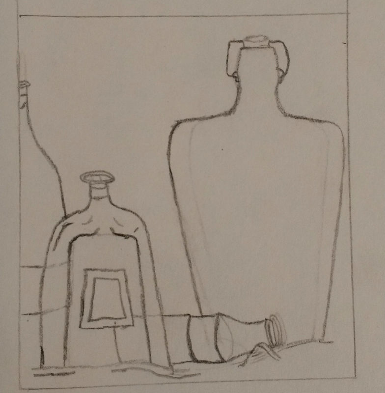
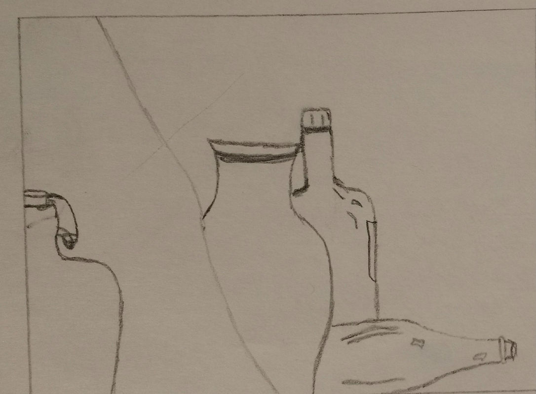
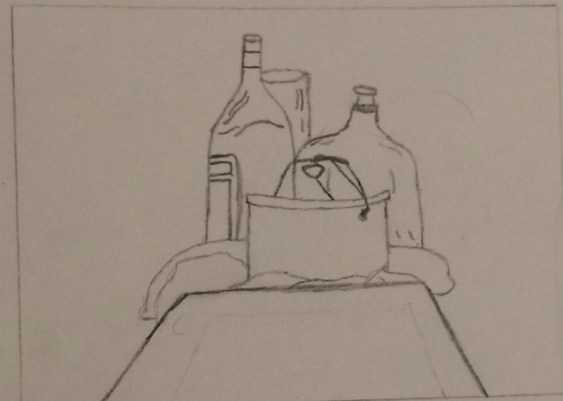
My composition was located near the cheetah print bottle. That bottle, a Coca-Cola bottle, a wine bottle, and another liquor bottle was included in my composition. I also made sure to incorporate the white cloth in the background of the image. I made sure to have a lot of contrast with the shade to add depth to each of the bottles and cloth. Overall, I would say that my composition was pretty successful because I was able to incorporate all the bottles that I wanted. 2. Did you use a wide range of values? (A range from white to black with at least 9 values). Explain how is this evident? I attempted to use a wide range of value so it would be easy to distinguish the different bottles located within the image. The bottles could have used more value so it would be easier to find the curves on them. The values that I did use definitely added plenty of depth and reflection to the bottles, and the cloth, making it easy to spot the curves and edges located on the material. In all, I believe that I used a good amount of value, but maybe not enough. 3.Explain how your knowledge and creating practice studies with value contributed to your piece. Before making this piece, I had little to no knowledge about value and how much it would contribute to my piece. After getting value explained to me, I was able to take that newly learned knowledge and apply it to my piece. Before I used value on my piece, the class practiced using value and that helped me learn the technique involved. I was able to create shadows, reflections, and depth with value. Without the knowledge and practice of value, my piece would not have been as complex as it is now. 4. Describe the blending and transitions in your objects (discuss your use of pressure with pencil and other techniques to achieve this). While shading in the bottles, I had to be cautious about what areas were light and what areas were dark. To achieve the difference between the areas, I had to be aware of the pressure I was putting on the pencil. The darker areas I pressed harder while the lighter areas I had little to no pressure on the pencil. I also had to shade ''with the bottle''. This meant that I had to give my lines curve where the bottle curved to give it a 3 dimensional figure. The cloth was a little bit different because shading ''with the cloth'' meant that I had to shade in multiple directions to give it depth. 5. Explain how your interpretation of texture is essential in capturing the look of the object. The interpretation of texture is essential because without texture, it would be difficult to distinguish what was glass, cloth, table, etc. Having texture, you're able to tell what the material is which allows you to see the object. For example, if you had bottle rough looking. Would you be able to tell if the object was a bottle? Having a smooth texture gives the bottle a reflective look making it easy to tell what it is. 6. If you could recreate your piece what would you do differently to enhance the final outcome? If I could recreate this piece, I would have gone slower through the steps. I missed a day of class which caused me to rush through the project. Taking more time on the sketch, more time on shading, and more time on making sure everything blended would have made the final outcome a lot better than it is. Overall though, I thought I did pretty well for my first project. I hope to see improvement throughout the rest of the semester because I thoroughly enjoy art. |
^ Assessment Photos ^\/ Shading Photos \/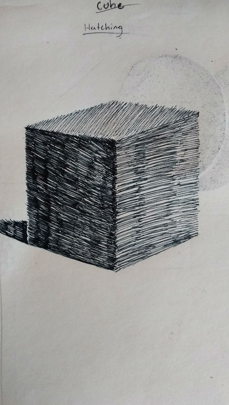
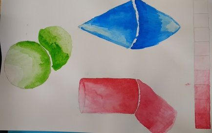
Cube (Hatching)
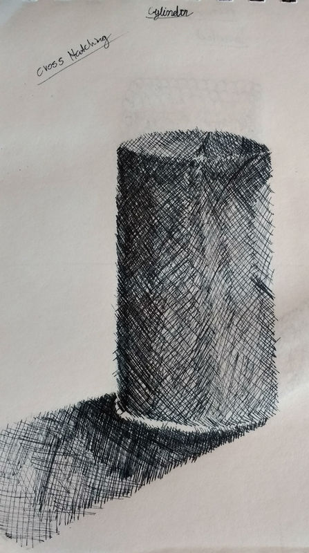
Cylinder (Cross Hatching)
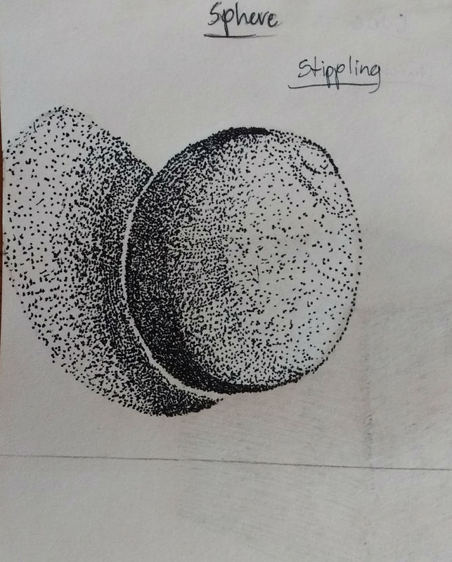
Sphere (Stippling)
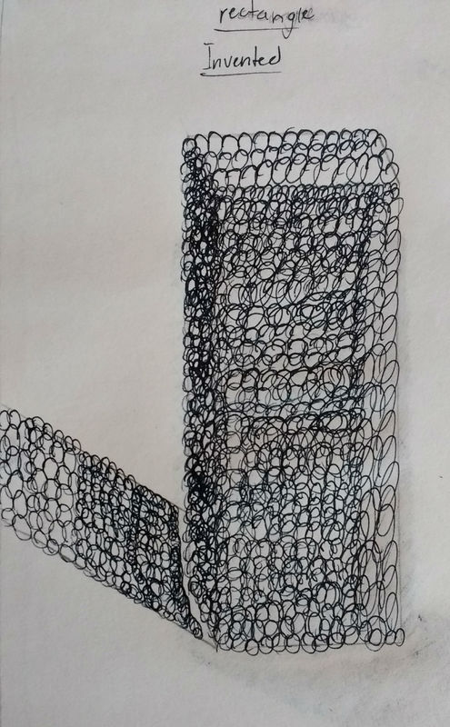
Rectangle (Invented)
\/ Perspective \/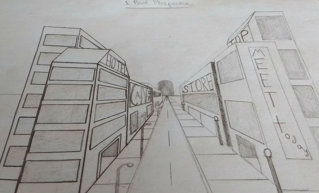
1 Point Perspective
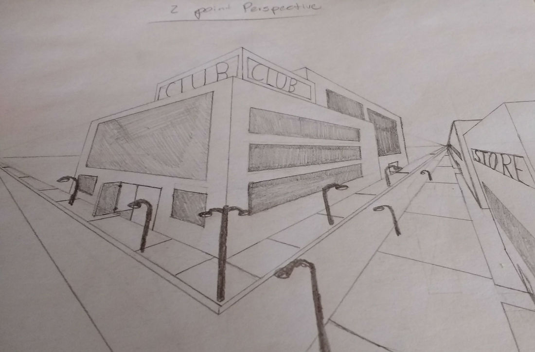
2 Point Perspective
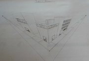
3 Point Perspective
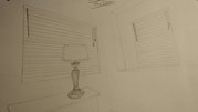
Corner of the Room
|