|
1.) Describe the craftsmanship of your sculpture. (Is it neat and well executed?)
The craftsmanship of my sculpture not-so-neat. When I made the bowl it was too flimsy and too wide. Also, while it was being fired the bowl chipped at one end. Plus, the noodles that I made could have been better. 2.) What was the most difficult part of this project? The most difficult part of this project was painting. I say this because I had to do multiple layers on the bowl and noodles. Also, I had to add value to the noodles which was difficult. I tried to add some light paint over the dark paint, but it still didn't add the value I wanted. 3.) Did your color choices work together harmoniously? My color choices, in my opinion, worked together harmoniously. They really brought out each other's colors. The black brought out the yellow and white and the yellow brought out the black of the bowl. 4.) Is your sculpture interesting from all views? It's interesting from some views. Because my bowl was chipped, it was not to interesting from the chipped side. 5.) Describe the differences in constructing a sculpture and doing something 2D. When constructing a sculpture, I feel like it takes less work than making something in 2D. When I made the sculpture, I felt like I could be a little more 'loose', that I didn't have to make it focus on the detail as much. When I make 2D art, I tend to focus a lot more on detail and making it a quality product. 6.) Does your sculpture look like the actual food? How did you accomplish this? My food does not really look like actual food. If it does, then I accomplished this by making the noodles like flimsy like normal noodles. I also added a little bit of a faded look because that's what they look like when they come out of boiling water. 7.)What would you do differently if you were to do this project again? If I were to do the project again, I would spend more time in adding details to the bowl and noodles. It looks sloppy and the bowl chipped. I would have made the bowl thicker and added more value to the noodles.
0 Comments
1.) Who was your referenced artist for the painting? Name 4 main ideas you used from your research to create your painting.
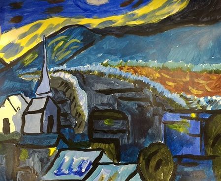
Wayne Thiebaud -Simplicity -Simple Colors -Minimum number of objects -Use of shadow 2.) Describe the craftsmanship of your project. The project that I produced was well executed, but it was not so neat. I did a good job incorporating all of the necessities that makes the project look like a Wayne painting. I did rush a little so it came out a little messy, but i'm happy with the final product. 3.) What was the most difficult part of this project? I know this sounds weird, but staying in the lines. It was hard to keep the paint from going to another spot that I didn't want it to go. It would have been a lot better if I used tape to keep it from 'leaking'. 4.) Describe your color choices and how they reflect the work of your chosen artist? My artist used a lot of simple colors. He would have the background be a color that brought out the color of the objects in his work. I chose to do the same by making a light color be the background and have the objects be a darker color. 5.) Describe how the style of your landscape reflects your chosen artist. The style of my landscape reflects the Wayne's simple landscapes. In his paintings, he always has a limited amount of items on the page and a background that brings out the color of the objects. So for my painting, I chose a landscape that had very few items and I made it so the background brought out the colors of the cups and the color of the shadows. 6) What do you think your chosen artist would say if he or she could see your painting today? My artist would probably say that I did a good job representing his work. He would think that I did a good job with the shadows and keeping the work simple. He would say that I could have made the project a little neater, but I think that he would like my painting. 7.) What would you do differently if you were to do this project again? I would take more time to complete the project and not rush through it. I would have also used different colors to make it pop more than it does. I would have also made the shadows a little neater as well.
2. Do you think you used a full range of values to create the illusion of depth? I believe that I did use a full range of values to create the illusion of depth. I used lighter colors to represent the bark of the tree, and darker colors to represent the crevices located on the bark. Also, I was able to make some of the pieces of bark stand out by pressing harder with the Prisma pencils. Lastly, I could have put a shadow near the plant to make it look more like it's not apart of the tree. 3. How do you think you represented the style of the artist Georgia O’ Keeffe? Georgia O' Keeffe's style of art was generally close up paintings of nature. With mine, I did exactly that, but with Prisma. I chose to do something in nature. In this case, a tree. I was able to capture the detail of the bumps on the bark, just as O' Keeffe captured the details of the curves on the flowers. Overall, I was able to implement her close up technique towards my project. 4. Describe your choice of colors/color harmonies and how you used them throughout the artwork. The colors that I used were based upon the reference photo. The tree that I used had, mainly, white bark with green highlights all throughout. For the darker areas, I used a dark red and added blue to it to give it an abstract look. The colors somewhat match, but I used different colors to make it my own. Overall the colors used seem to blend well and mix well. 5. How did you create contrast in your drawing? I was able to create contrast in my drawing by using different colors. Because the white of the bark was so bright, I used black paper to bring out the color and make it pop. Also, to emphasize the darker spots, I used darker colors. Plus, to make it so you could see the plant that came off the tree, I colored that area darker then the bark making it stand out more than if I lightly colored it. These techniques made it so I could create contrast within my drawing. |
^ Assessment Photos ^\/ Shading Photos \/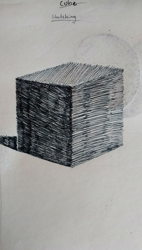
Cube (Hatching)
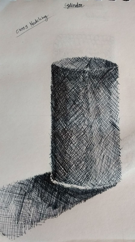
Cylinder (Cross Hatching)
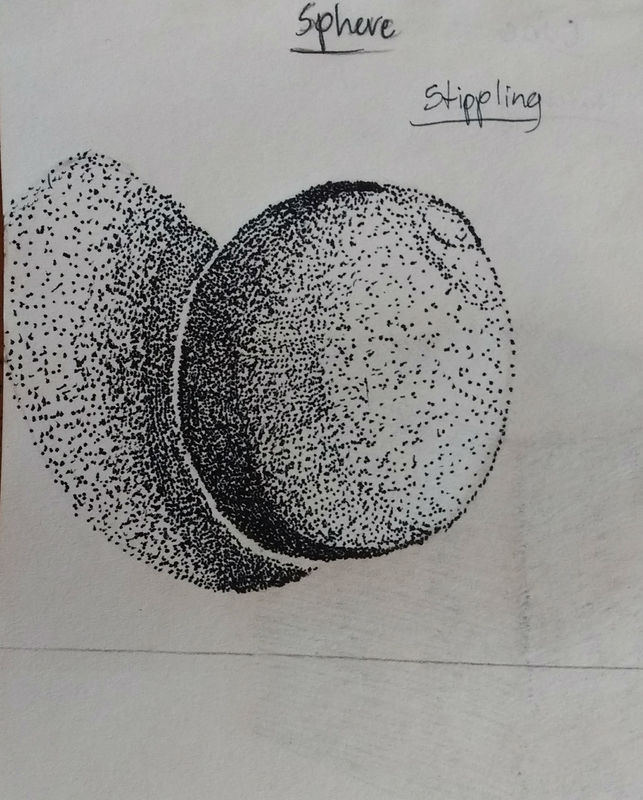
Sphere (Stippling)
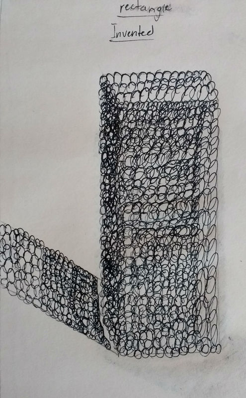
Rectangle (Invented)
\/ Perspective \/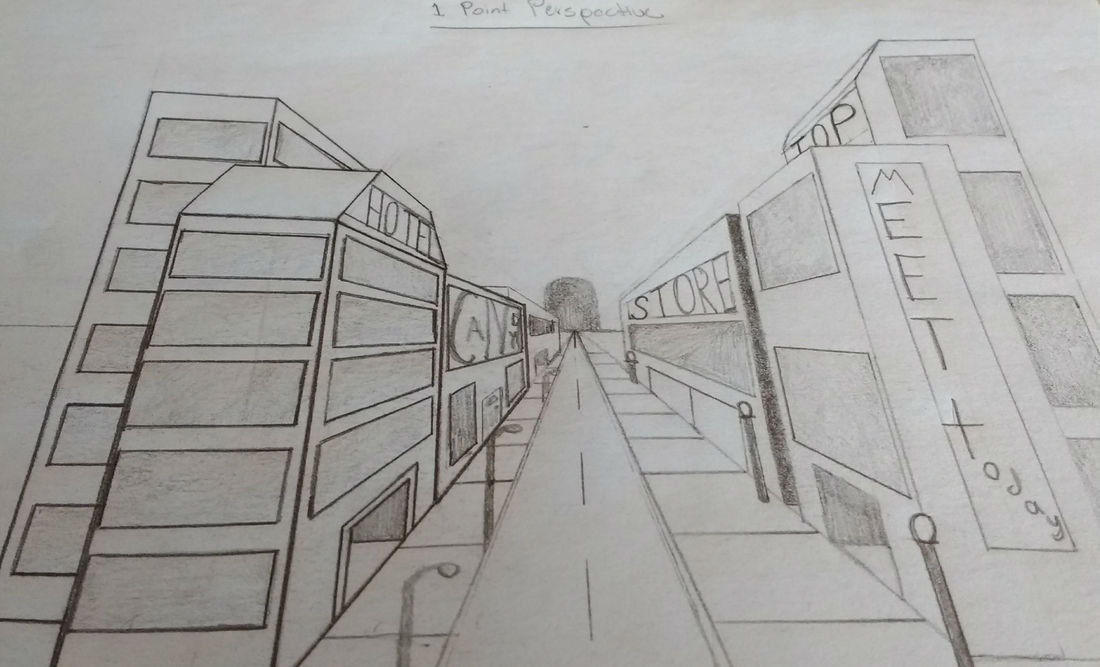
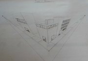
1 Point Perspective
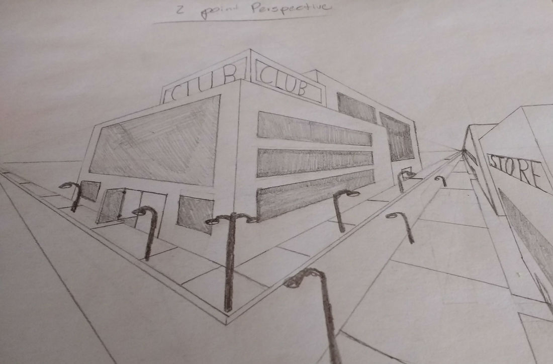
2 Point Perspective
3 Point Perspective
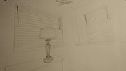
Corner of the Room
|